2024
Aroma on Wheels
Food that follows you
Overview
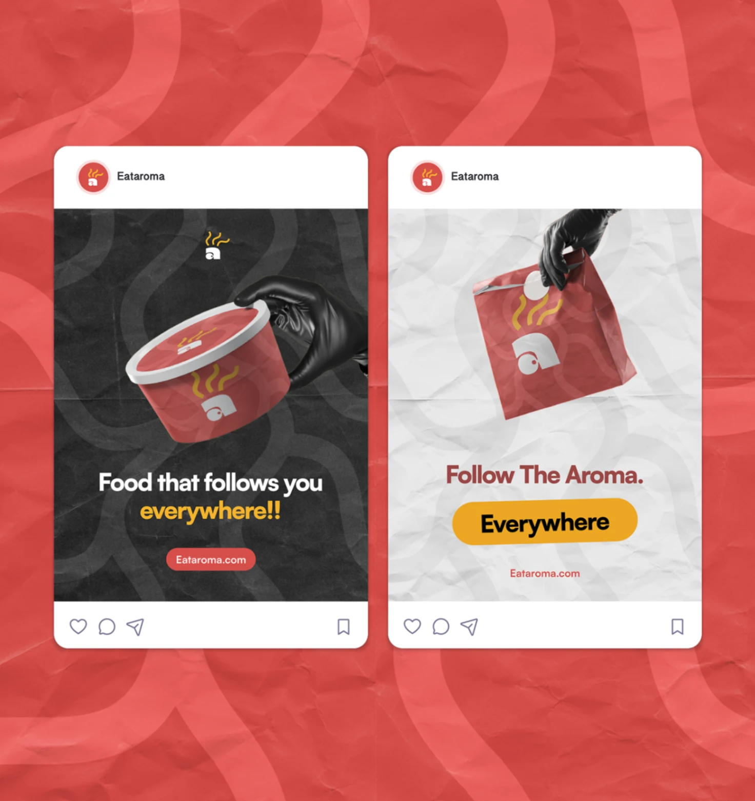
Aroma on Wheels is a mobile fast-food concept built around one clear promise: affordable, well-packaged food that meets people where they already are. I shaped the identity into a vivid street-facing system across packaging, social, and outdoor mockups so the brand feels immediate, memorable, and made for motion.
The problem
Fast-food branding often feels interchangeable or too polished to belong to the street. Aroma on Wheels needed an identity that could feel affordable, energetic, and culturally local while still looking considered enough to scale across packaging, billboards, and social campaigns.
The system starts with a simple brand truth: food should meet people where they are. From there, the identity leans into motion, appetite, and instant recognition — a warm red base, a steam-led mark, and a graphic rhythm that keeps the packaging feeling alive even before copy shows up.
01 · Core identity
Built to feel hot, mobile, and hard to miss.
The symbol, steam motif, and rounded wordmark cues are pushed toward memorability rather than polish for polish's sake. The result is a brand that feels street-ready: bright enough for outdoor visibility, simple enough for packaging, and expressive enough for social storytelling.
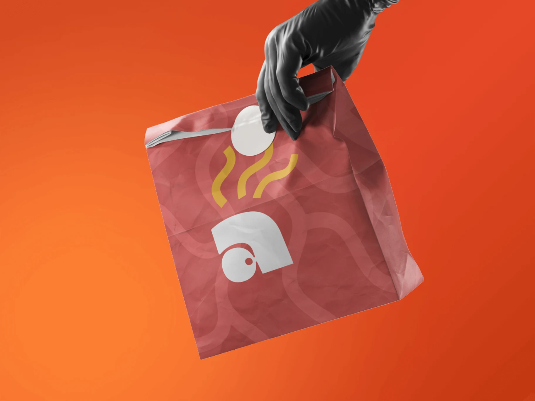
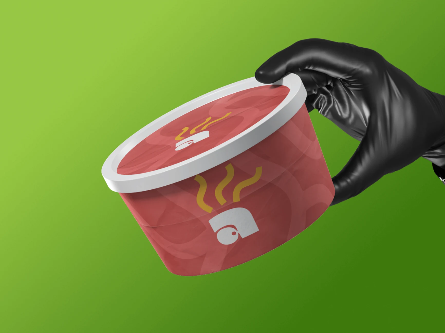
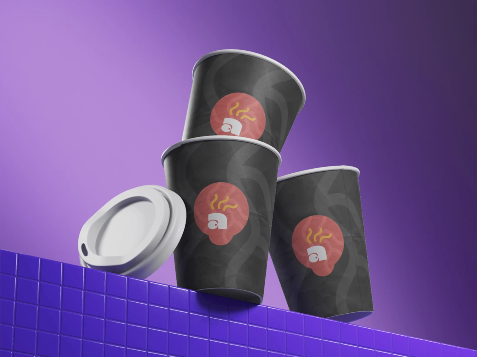
02 · Packaging
The brand shows up strongest when it's held.
Packaging carries most of the emotional load for a food concept like this, so the mockups focus on tactile red surfaces, simplified icon placement, and repeatable patterns that can scale from bowls to boxes to takeaway bags without losing recognizability.
03 · Campaign language
Short lines. Loud colours. Street-speed messaging.
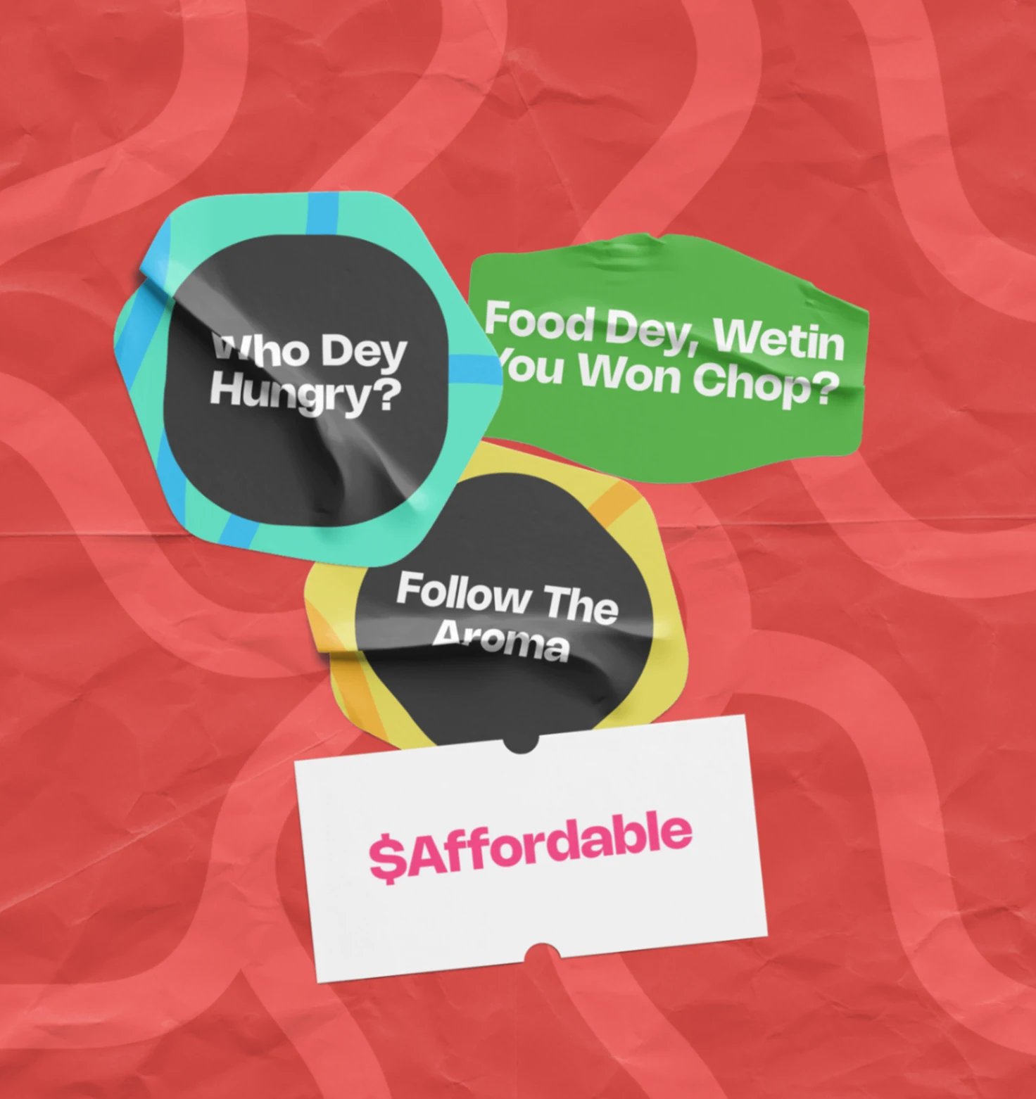
The campaign direction uses quick, chant-like lines that can live on stickers, social posts, and point-of-sale graphics. The aim is to make the brand feel conversational and local, with enough boldness to stop a scroll or hold attention from the street.
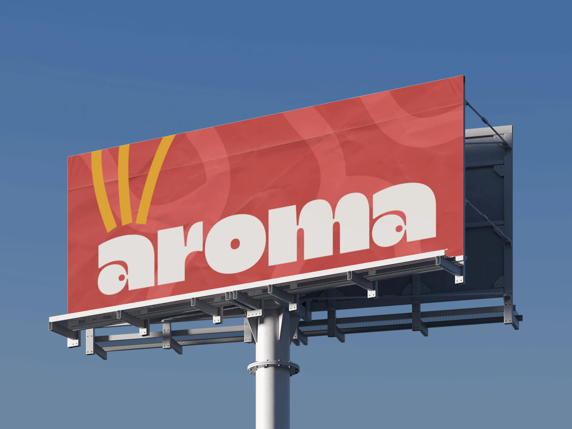
04 · Outdoor presence
Scaled for the street, not just the mockup wall.
The billboard direction proves the mark and color system can stretch beyond packaging. Even with minimal copy, the identity stays legible and confident, which is exactly what a mobile food brand needs when visibility is part of the product experience.
20
Branded visuals across identity, packaging, campaign, and outdoor
4
Core application zones — identity, packaging, social, outdoor
360°
Identity built to move across touchpoints
Result
Aroma on Wheels lands as a food concept with a clear street-facing personality — energetic packaging, fast campaign language, and an outdoor-ready identity system that can travel wherever the product goes.
Outcome
Aroma on Wheels becomes a more ownable food brand through a high-visibility identity system that feels equally at home on packaging, social campaigns, and the street.
Next project
EngageMix
A whole marketing team, running inside one chat.